Understanding Candle Analysis: Interpreting Bullish Candlestick Patterns
Candle analysis is the phenomenon of tracking the movement of securities. It is a centuries-old Japanese charting technique where traders used the candlestick patterns to analyze the rice markets. Candle analysis offers traders of stocks and other financial markets a great visual aid to what a particular price has done within a specific period. It has essentially made its way into modern-day price charting. Candlesticks are formed by highlighting a candle, which is the main body, a solid area between the close and open price, and wicks, which denote the low and high. Investors find candle analysis more visually engaging than the standard bar charts and the price actions easier to understand.
Each candlestick symbolizes one day’s worth of stock price data. The candlesticks, over time, group into recognizable patterns that traders of stock can use to make selling and buying decisions.
Candle Analysis – Reading a Single Candlestick
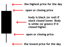
Each candlestick represents the stock price data generated in a single day through four pieces of information:

- The opening price
- The closing price
- The high price
- The low price
Candle analysis is done by looking at the candle (central rectangle), which is the real body. The central rectangle conveys to traders whether the closing price or the opening price was higher. A filled or black candlestick means the closing price for a specific time frame was less than the opening price – indicating pressure selling with a concern that it is bearish.
On the other hand, during the candle analysis, if the candlestick is hollow or white, it states that the opening price is lower than the closing price – indicating buying pressure with a concern that it is bullish.
‘Shadows’ are the lines at both the ends of a candlestick and denote the entire range of price action for a particular day – from low to high.
- The lower shadow indicates the lowest price of the stock for the day
- The upper shadow suggests the highest price of the stock for the day
Candle Analysis – Interpreting 3 Bullish Candlestick Patterns
The Hammer

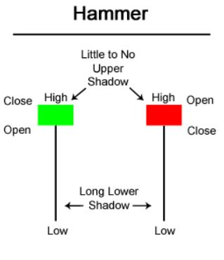
The Hammer is a bullish reversal candlestick pattern signalling that a stock is approaching the lowest in a downtrend. This type of pattern is formed when market participants reject resistance or support. This type of candle analysis indicates that the sellers are driving prices lower during the trading session, followed by intense buying pressure. If you use default colour candlesticks, the Hammer candlesticks can be green and red where the main candle (central rectangle) is at the upper end of the trading page.
The Piercing Line
The Piercing Line is a two-candle bullish reversal candlestick pattern arising in downward trends. In the Piercing Line candlestick pattern, a white candle follows the long black candle in which the white candle opens lower than the previous close. Subsequently, the buying pressure thrusts the stock prices up into the central rectangle (real body of the black candle).
The Bullish Engulfing
The Bullish Engulfing, like the Piercing Line pattern, is a two-candle reversal pattern. Candle analysis for the Bullish Engulfing pattern is done by analyzing how the second candle entirely ‘engulfs’ the main rectangle body of the first candle. The Bullish Engulfing pattern is a grouping of one dark candle followed by a bigger hollow candle, and it appears in a downward trend.
Candle analysis is one of the best ways to study the psychology of market participants in stock trading. Candle analysis provides an extra layer of evaluation over a fundamental analysis forming the foundation for trading decisions.
